X Axis Units- Excel Charts
I thought I would share this problem I ran into charting so that you don’t start banging your head against the wall as I considered doing.
I have used this same data in a many different versions of Excel and never had a problem until Excel 2016.
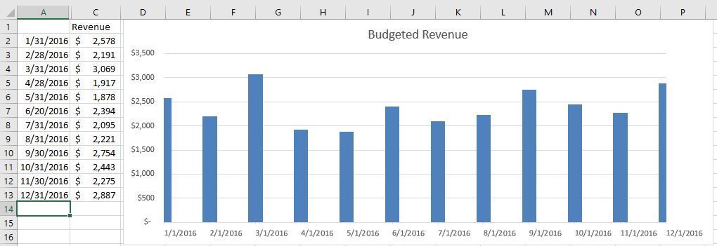
I charted some data and I went merrily on my way until at some point I noticed big problems with my X axis.
Do you see the problem? Take a look at the X axis. At first glance, it looks okay and then… hmm.. issues here.
Excel 2016, by default, apparently uses days so it is showing the first day of the month.
Unfortunately, most businesses are more interested in the last day of the month.
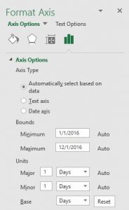
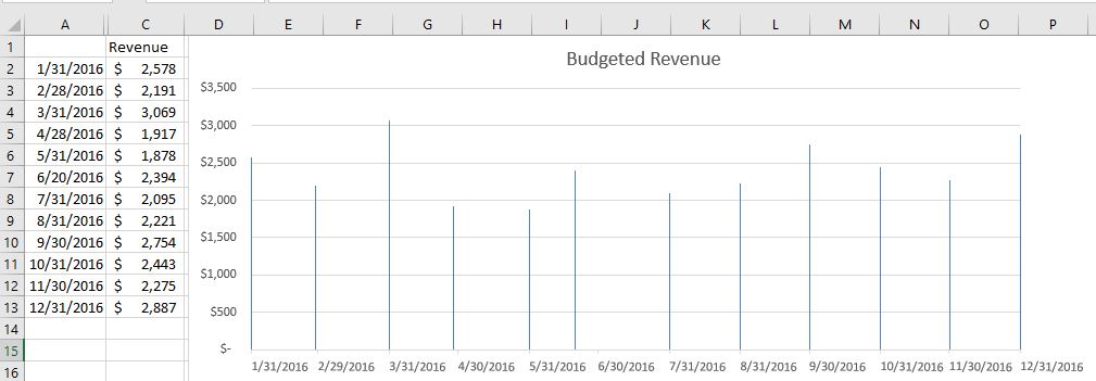
To fix this, right-click on the X axis and select Format Axis and change the base from Months to Days.
Your chart should now correctly reflect the data from Column A.


